• Skip to primary navigation
  • Skip to main content
  • Skip to primary sidebar
  • Skip to footer

ARTBAR

raising creative thinkers

  • MY BOOKS
    • Art Workshop for Children
    • Cardboard Creations
  • ART SUPPLIES
  • SHOP
    • Art Bar on Etsy
    • Art Class Poster
  • ABOUT
  • Nav Social Menu

    • Facebook
    • Instagram
    • Pinterest

Color Mixing for Art Class

November 3, 2020 by Barbara Rucci 15 Comments

591 shares
  • Facebook

I’ve been wanting to make a color theory and color mixing video for YEARS! I’m so exciting to finally share this video that I made showing you how I mix my colors for art class with tempera paints.

(Watch Part 2 here, where I show you how to mix skin tones using primary colors.)
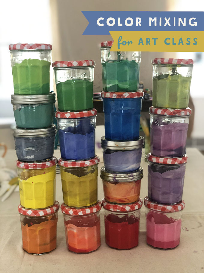
Color mixing tempera paints for art class! In this video I will show you how I make vibrant and opaque colors for use on cardboard, paper, and more. Learn about primary, secondary, and tertiary colors (the best ones to make)!

[ I am a participant in affiliate programs designed to provide a means for bloggers to earn small fees at no cost to you by linking to Amazon.com and affiliated sites. ]

If you want to mix along with me, here are the materials you will need.

Color Mixing Paints and Supplies:

~ Blick Student Grade Tempera Paint (16oz blue, red, yellow, orange, magenta, violet, green, black, and 32oz white)

~ RAS Tempera Paint – I use this brand in the video but I can’t find it online. I got it at my local art supply store.

~ Crayola Tempera Paint – set of 8 basic colors in 16oz bottles (I used Crayola all the time and it works just as well as RAS)

~ Crayola giant white tempera

~ Other specialty tempera colors – Crayola magenta, Crayola shocking pink

~ Jam jars (we buy Bonne Maman with the gingham lid – they are the perfect size)

~ Plastic knives for stirring and mixing

~ Muffin top pan (for storing jars of paints) or a cardboard box that is no taller than the height of the jars

Watch the Color Mixing Video!

In this video (above) I show you all my tricks. I begin by showing you the color wheel and talk a little about primary, secondary, and tertiary colors. I show you how to get more opaque colors, and how to mute a color using it’s complementary color on the color wheel. Mixing paints sounds intimidating until you see how easy and foolproof it really is. Start collecting those jam jars!

(Click here if you can’t see the video above.)
Color mixing tempera paints for art class! In this video I will show you how I make vibrant and opaque colors for use on cardboard, paper, and more. Learn about primary, secondary, and tertiary colors (the best ones to make)!

Here is a quick color theory and color mixing overview with a few photos from the video.

Color Mixing for Art Class

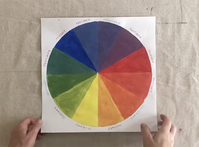
1. Let’s start with the color wheel. You have your primaries: red, yellow and blue. Then you have your secondaries (the colors that are made by mixing two primaries): orange, purple and green. Lastly, you have your tertiaries. These are the hundreds of colors that are made by mixing one primary and one secondary, which are by far the most beautiful and interesting colors with the best names.

For example: blue + green = teal, red + orange = coral, purple + red = mauve, yellow + green = lime. And on and on. I spend most of my time mixing tertiary colors since the primaries and secondaries come right out of the bottle. You can buy tertiaries out of the bottle, too, but where’s the fun in that? It’s good to learn the theory behind color mixing. You can buy as many colors of paint as you want, but to know how to mix them yourself with just the basics is really satisfying.
Color mixing tempera paints for art class! In this video I will show you how I make vibrant and opaque colors for use on cardboard, paper, and more. Learn about primary, secondary, and tertiary colors (the best ones to make)!

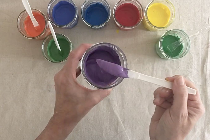
2. Here I have mixed the 3 primaries and 3 secondaries. (I actually mixed two different blues, one was cooler and one was warmer.) By “mixed” I mean I added white to all of them. Adding a little white makes them more opaque, which is important when painting on cardboard. We paint on a LOT of cardboard.
Color mixing tempera paints for art class! In this video I will show you how I make vibrant and opaque colors for use on cardboard, paper, and more. Learn about primary, secondary, and tertiary colors (the best ones to make)!

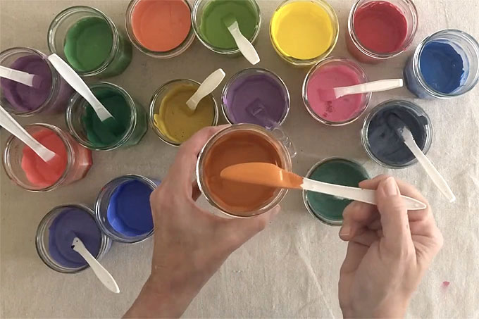
3. Now comes the fun part, which is mixing all the tertiary colors. In the video I make teal (blue + green + white), mauve (purple + pink + white), chartreuse (yellow + green + white), coral (orange + red + white), periwinkle (blue + purple + white), pumpkin (orange + drop of blue + white), mustard (yellow + drop of purple + white), and a few more.

The theory behind mixing a “drop of blue” with orange, or a “drop of purple” with yellow has to do with complimentary colors. On the color wheel above, yellow and purple are opposite each other on the color wheel. As are red and green, and blue and orange. The theory is that if you mixed the complementary colors in equal amounts (this term is actually misleading in that normally the word complementary means getting along, but in this case the colors cancel each other out, so I often use the word contrasting instead) — they would make brown. (This is in fact how I make the skin tones in my PART 2 video.) But if you use just a drop of the complementary color, then it mutes the color in a way that you wouldn’t be able to do by adding gray or black.

So adding a drop of purple to yellow makes it mustard, and adding a drop of blue to orange makes it a pumpkin spice, and adding a drop of red to green would make it an olive. This is in fact how I mix my most favorite colors. It’s so fabulous to have a table full of color options for children that aren’t just the usuals. They notice the difference between a bright and a muted orange, and they appreciate learning new vocabulary.
Color mixing tempera paints for art class! In this video I will show you how I make vibrant and opaque colors for use on cardboard, paper, and more. Learn about primary, secondary, and tertiary colors (the best ones to make)!

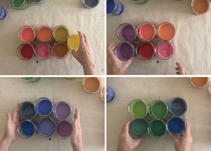
4. Lastly, let’s talk about color families. I like to put out color families for certain projects. If we are printmaking for example, or if I have some very young children who I know will just plop their brush in every color. Putting out a color family prevents paintings from turning greyish and mucky. There is definitely value in letting toddlers mix all the colors, and they do not care at all – it’s all about the process for them. But if you want their paintings to stay brighter, then put out a color family. This means choosing colors on the color wheel that are next to each other, from one primary to the next and everything in between.

So all the colors in between red and yellow are a family (oranges, peach, pinks, mustard). And all the colors in between blue and red are a family (purples, periwinkle, mauve). And so on.
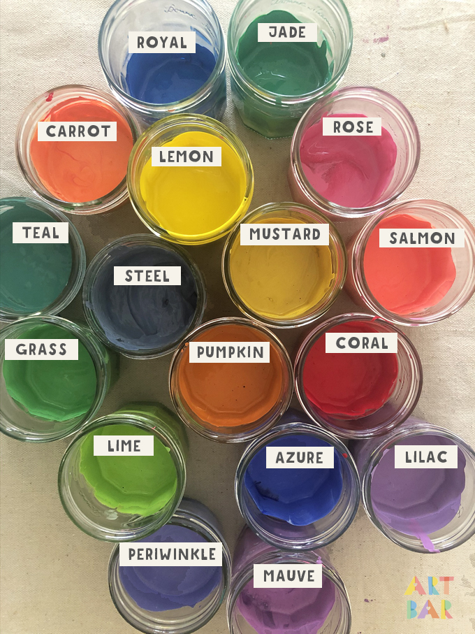
Color mixing tempera paints for art class! In this video I will show you how I make vibrant and opaque colors for use on cardboard, paper, and more. Learn about primary, secondary, and tertiary colors (the best ones to make)!

Mixing colors is SO FUN!! And you really can’t go wrong. Just add white and any color becomes beautiful.

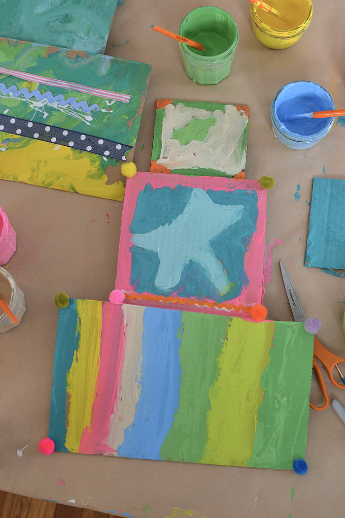
And here are some sample of painting on cardboard from art class. You can see how adding white to colors really helps with opacity and coverage.
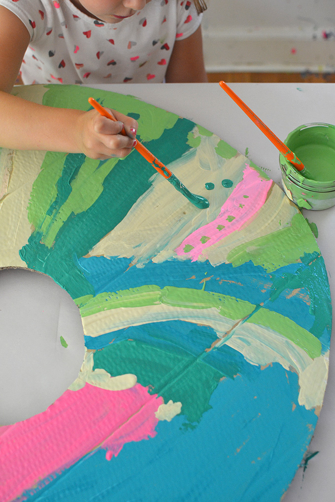
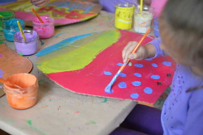
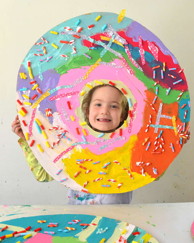
Mixing paint colors using tempera paints to paint giant cardboard donuts.

Mixing paint colors using tempera paints to paint giant cardboard donuts.

Mixing paint colors using tempera paints to paint giant cardboard donuts.

One last tip: I also always put out a jar of white or off-white and a jar of hot pink (linked up top under the supplies, and yes I mix a little white into the hot pink, too).

Be sure to watch my color mixing PART 2 video where I show you how to mix skin tones from primary colors.

Happy mixing!

xx Bar

– – – – – – – – – – – – – – – – – – – –
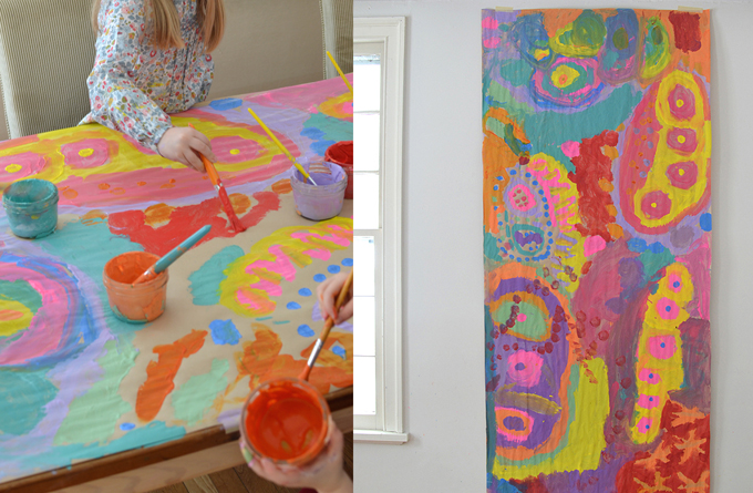
Did you like this post? Here are more projects with tempera paints:

Painting on a table covered in butcher paper using tempera paints.

Collaborative Table Painting

Giant Cardboard Donuts with kids

Giant Cardboard Donuts

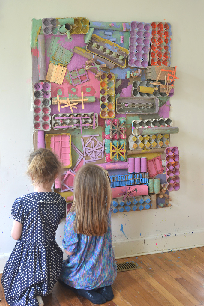
Recycled Art Wall with kids

Mixing Paints for the Recycled Art Wall

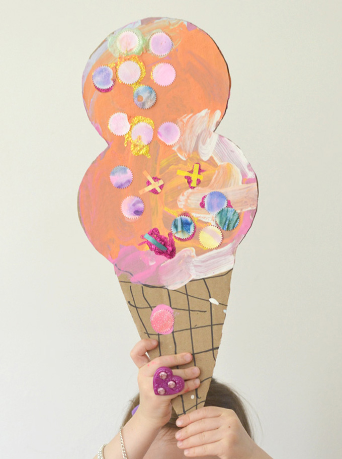
Cardboard Ice Cream Cones with kids

Cardboard Ice Cream Cones

Filed Under: Learning at Home Tagged With: complimentary colors, glass jars, muffin top pan, primary colors, tempera paints, color theory, color wheel, secondary colors, tertiary colors

Previous Post: « Clare Youngs Artist Study
Next Post: Mixing Skin Tones Using Primary Colors »

Reader Interactions

Comments

  1. Camille

    November 5, 2020 at 11:15 am

    Hi Bar!

    Thanks for sharing this!

    Just wanted to ask how do you dispose of the paintbrush rinse water from any of your painting activities? Do you have different methods for different paint medium (acrylic, tempera, etc.)?

    Also, how do you manage/store left over paint?

    I do art with kids and have used tempera and acrylic paint this season. I’m a newbie to organizing and cleaning up paint materials and would like to learn the best practice for clean up and disposal of waste produced in painting with kids.

    Thank you!

    Reply
    • Barbara Rucci

      November 5, 2020 at 12:52 pm

      Hi Camille! You just reminded me that I do have photos of how I store my paints, I will add those photos to next weeks color mixing post on how to mix skin tones. But basically I wash all my paint in the kitchen sink. I only use water-based paints so it’s not a problem. If I was using oil paints I would have to designate a different “art” sink for that. But acrylics and temperas both wash with water. I store my temperas in the jars, then put them in the muffin-top pan or a cardboard box (as seen in the video) and then stack them and store in a closet. I don’t usually save acrylics, unless we will continue a project to the next day, then I put some plastic wrap over the palettes. Check back next week for more color mixing and the photos of my art closets where I store my paints! xx Bar

      Reply
  2. Lisa

    November 5, 2020 at 12:36 pm

    I can’t seem to find the link to watch the video. Would you please direct me to the link? Thanks

    Reply
    • Barbara Rucci

      November 5, 2020 at 12:46 pm

      Hi Lisa, there is no link, the video is embedded right above where it says “Watch the color mixing video”- I hope you can find it! xx Bar

      Reply
    • Adrienne

      November 9, 2020 at 11:59 pm

      I’m in the same boat as Lisa! I’ve tried both Chrome and Safari, and a laptop as well as my phone. Help! I looked right where you said, above where it says “Watch the color mixing video” and I can’t see any link at all. I feel so dumb asking but…any ideas? I really want to watch it!

      Reply
      • Emily

        November 14, 2020 at 2:18 pm

        I can’t see the video, either! I’m on my iPad on Safari and I don’t see a link where you say it is. I’d love to see it sometime! Thanks!

        Reply
        • Barbara Rucci

          November 17, 2020 at 5:41 pm

          hi Emily, I added a link. Hope this helps!

          Reply
      • Barbara Rucci

        November 17, 2020 at 5:36 pm

        Hi Adrienne, I have posted an external link underneath the embedded video that says “Click here if you can’t see the video above” – hopefully this will work! xo Bar

        Reply
    • Rachel Withers

      November 14, 2020 at 9:50 pm

      I had this issue as well, but once I turned adblocker off, the video appeared. Hope that helps!

      Reply
  3. Becky Garling

    November 16, 2020 at 1:19 pm

    The video isn’t working for me either, on my phone or desktop computer.

    Reply
    • Barbara Rucci

      November 17, 2020 at 5:39 pm

      Becky, I have posted a link to the video.

      Reply
  4. Mary

    November 23, 2021 at 9:56 pm

    This is really just lovely. My mind has been opened to tertiary colors!! Arts and crafts at home have always had a certain level of blah to me but these colors have changed my mind. Now I want to do all the projects! Thank you 🙏🏼

    Reply
  5. ColorMix Fan

    July 29, 2025 at 8:34 pm

    This video and tutorial on color mixing for art class is so helpful! I love your emphasis on mixing tertiary colors like teal, coral and chartreuse. For digital design, I often use the WhatColorMake.com color mixer to experiment with different paint combinations and see the resulting RGB and HEX codes. It’s a great way to complement hands-on mixing. Thanks for sharing your methods!

    Reply

Trackbacks

  1. Process Art with Recyclables: Collaborative & Big! - ARTBAR says:
    October 1, 2025 at 7:58 am

    […] my temperas, even if it’s just adding a little white (you can see my paint mixing blog post here.) Adding white makes them more opaque, which is valuable when covering lots of brown surfaces. This […]

    Reply
  2. 10 Open-Ended Materials for your Art Space to Nurture Creative Thinking - ARTBAR says:
    February 18, 2026 at 2:16 pm

    […] and young children who like to mix all the paints together. I also talk about mixing tempera paints here on the blog, with links to my favorite brands. I hear from teachers that they don’t often set out tempera […]

    Reply

Leave a Reply Cancel reply

Your email address will not be published. Required fields are marked *

Primary Sidebar

The Creativity Project
RESOURCE FOR TEACHERS
Join our course!
Your subscription could not be saved. Please try again.
Your subscription has been successful.

Yes! I want to raise thoughtful and creative children. Send me more inspiration, please!

artbarblog

i make things✖️
creativity facilitator✖️
design as a lense✖️
author✖️✖️
mom✖️✖️✖️
blog at artbarblog✖️
teacher resources ⬇️
@the.creativityproject

I have been thinking lately about so many big idea I have been thinking lately about so many big ideas. They seem to be stuck, though, in the cogs of my brain. I need to articulate and connect these ideas together, but I can’t find the right words, or medium. It feels like trudging through thick mud, and then making the choice to set up camp in the muddy place. Maybe this is always what motherhood + living a creative life will be. And I am ok with that, too. Life is mucky, and even though I crave clarity, I am also acutely aware that this is why I also crave art. Music, books, museums, film, gardens… these are the mediums humans turn to when they need to find connection and, if we are lucky, clarity. But I feel more protective of my human-centered ideas these days and less willing to share them in spaces like this where they are open source. I don’t even know what is real sometimes. And how am I contributing to this landscape of creative and intellectual robbery. I think I am headed in a different direction but I don’t know what that is yet. Meanwhile, I am camping in the mud and looking for beauty where I am. 

Some moments new and old, lately…

1. Painting at my easel, age 4 when we lived in England before moving to the US. 
2. I tried making a video of motherhood on mother’s day inspired by this song 🌙 but never finished. 
3. Planting dahlias 🌸
4. Year 2 of my veggie garden. It is not going well. 
5. We diagnosed our garden problem as not enough sun so cut down a tree to give the sun a little path but then the sun moved. Also failing at science 😳
6. When you see your habits in your children ❤️ 
7. My mom’s caretaker gave me a cake and now I am a whole year younger 🙏🏼
8. Thank you James for the treats, mom dreams of traveling to visit your bakery but this was the next best thing 🥐
9. Finding 50 bucks in jeans from 20 years ago 👏🏼 Always check the pockets!
10. The newly graduated makeup artist with her kit off to a job 💋 
11. When the birthday kid isn’t home it’s too sad. must make art. 
12. When I am so dumb and share it on the internet 🙃
13. My heart, my clarity ❤️
14. Another round of silkscreening! Things are happening. 
15. MUA by Ava, and hanging out with the help 😍
16. Reminder.
Happy Earth Day! Can we agree that every day is Happy Earth Day! 

Can we agree that every day is Earth Day? The older I get, the more I change my habits to be kinder to this beautiful planet. Lately, seeing the photos from Artemis II of Earth from space has really moved me to make even more planet-friendly choices. Here are some things we do at home, and of course, we could always be better, but I also think small changes are more doable and sustainable, and if millions of us did just one of these things, it would make a difference.

Ok, here goes! My hope is that someone reads one of these actions and thinks, I can do this! We cannot reverse the melting ice caps, but we can stop further global warming… humans can do this if we work together. It starts small and is community-driven, so share this with friends!

1. Eating less meat, eating more veggies (this is also called eating low on the food chain). A vegetarian or vegan diet is a low-carbon diet. Did you know switching to 2/3 vegan reduces your carbon footprint by 60%? 
2. Grow our own veggies. Save on emissions and packaging, and find joy in gardening.
3. Less food waste. Eat leftovers, clear the fridge.
4. Buy less. Buy local.
5. Repurpose, fix, mend, thrift.
6. Make homemade gifts.
7. Drive less, fly less. (This one is harder, but being conscious of it is really important.)
8. Moderate, steady thermostat settings can save so much energy. Try 67/68 F in the winter and 72/73 in the summer and don’t touch it.
9. No pesticides on our lawn. It may not be pretty, but we have never had a beautiful lawn, and I’m fine with that. We also live on a river so the thought of polluting that water so I can have a perfect lawn is crazy.
10. Using non-toxic cleaning products or making our own from vinegar.
11. This year, we will do “no-mow May” to promote biodiversity, help the soil, and reduce emissions.
12. Vote for candidates who take climate change seriously!

Add some things you are doing in the comments. This is a judgment-free zone, so no preaching! But for real, we all can do a little bit better. 

The blog post about these signs is on artbarblog.com, link in bio!
New blog post! It’s about time I share my favorite New blog post! It’s about time I share my favorite materials that I bring to the library. Read the post for links and tips for how to pair these materials to foster deep engagement. Children have always needed time in childhood to use their hands to make things and play, but now more than ever, the skills they develop through these experiences are imperative for their future well-being and success. I’ve been reading everywhere about children’s “lost skills” in this new ed tech world where screens have replaced so much hands-on learning in the classroom, even as young as preschool 😞 Communication skills, flexible thinking, regulating emotions, building empathy for others, innovating, even core strength and pencil grips are a struggle. Offering time and materials for making things and playing with ideas should not be a challenge; it should be as essential as filling bodies with fresh air and food. Play is how children learn! Anyway, I hope this post will inspire you to collect some things for making and maybe even join our Materials Matter course over on @the.creativityproject so that you, too, can become an expert at cultivating creative thinking through art making!
It’s almost impossible to concentrate or sleep or It’s almost impossible to concentrate or sleep or work or enjoy anything these days. I know joy is resistance, art is resistance, kindness and empathy are resistance, and I try and practice all of these things every day, and also boycotting and shopping local and volunteering and making calls and checking on my neighbors and bartering and keeping our big tree lit for the community. And still, it doesn’t feel like nearly enough. I know we probably all feel this way. And maybe the collective small things really do add up to bigger movements, I don’t know. It’s Sunday and my mom is in the hospital again and I miss my one at college and I had such a bad dream last night. My headspace is not in cheerleader mode which is my usual default. And yet… going through my camera roll to find photos of things I made did actually help today. And I have made a plan for future things to make. When I wake up in the middle of the night, the way I get myself back to sleep is by envisioning this one big installation idea I’ve had for years, it takes place in a forest and involves textiles. So maybe 2026 is the year for me to bring this to life, or begin the process. I think about this quote, and it helps, too: When you make art, you rebel against a world that fears vulnerability. Ok, I’m better. Thank you for listening 🤪❤️

Ps: It weighs on me that Meta should be part of the boycotts. If anyone has any ideas for building community and sharing somehow somewhere else let’s discuss.
Follow on Instagram

Categories

Archives

Copyright and Reposting

All content on this blog is copyright and owned by Art Bar Blog unless otherise stated. I would be flattered if you wanted to use an image from one of my posts! But please, ask me first. I would also ask that if it involves DIY instructions with a list of supplies that you don't repost any of that stuff because then nobody would have a reason to click back to my original post!

Footer

  • Facebook
  • Instagram
  • Pinterest

About Me

There are two things that I'm passionate about: Children + Art. As an art teacher, author, graphic designer, and mom to 3 creative thinkers, I get to explore my passions every day! Learn more...

I am dedicated to keeping your information safe. Please review my Privacy Policy.

Recent Posts

shibori tie-dying with kids in art camp

Copyright © 2026 · Foodie Pro & The Genesis Framework