
I am a font snob. It’s true. As a graphic designer, I am a total geek about typography. I even read type journals. People who design fonts are rock stars in my world. The reason I love fonts so much is because they are the foundation of good design.
Sometimes I get asked how I choose fonts for my blog photos, and what are my go-to tricks. My usual answer is that I wish I had tricks! Typography is an art form to me. There is no easy way to lay type over a photo. It’s as hard for me today as it was when I first started out. It takes time. But you can build your confidence with practice, and you can learn to make the right choices. It’s all about developing your eye for design.
{Yes, I ended both of those paragraphs with the word design. It’s my most important message here.)
There is a reason I’m interested in elevating the quality of your work…so I can pin it! I am pretty picky about what I curate for my Pinterest boards. I see so many amazing projects that are ruined by type. Sorry, I hope I’m not being mean. It’s just that…well, there is room for improvement!
So here we go… Blog Typography 101. My ten tips that will help you make better choices and put you on the path to good design.
Tip 1: just say no {to fonts}
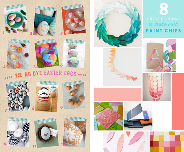
Let’s be clear. The only reason any of us put type on our photos is to make it stand out on Pinterest. So people will pin it. Because they can see it, in theory. But here’s the interesting thing, I believe that pins without type actually do better than pins with type.
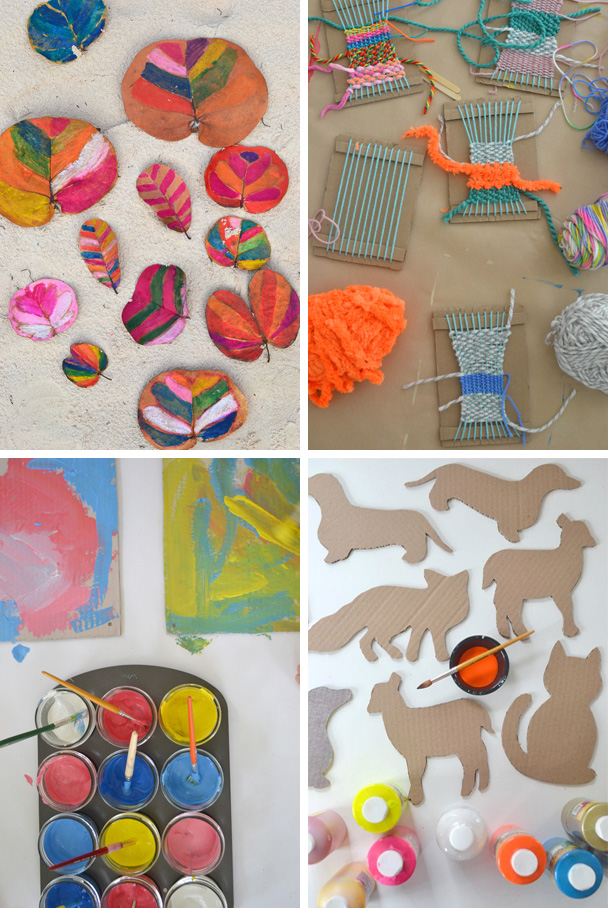
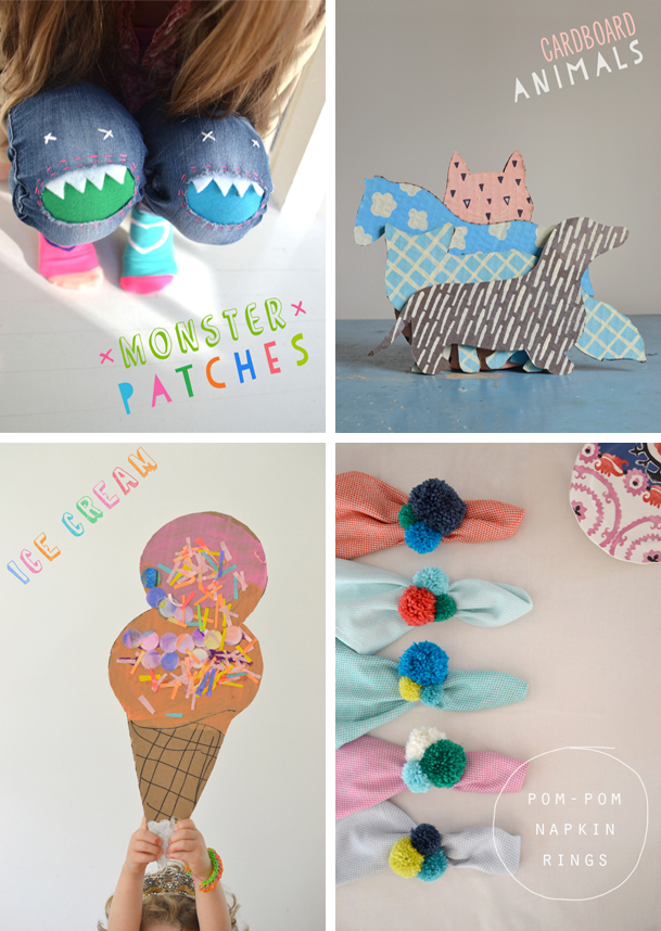
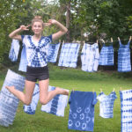
My best pins this month have no type on them at all. In fact, they aren’t even necessarily my main post photo. Above are four of my best pins lately:
painted leaves // weaving with kids // cardboard paintings // animal templates
Except for the leaves, none of these were the main photo in my post. Here is the reason they work so well without type: because they speak a thousand words. The colors and composition are pleasing to the eye, and there is nothing more to say.
TAKEAWAY ~ Use type for two reasons only:
1. If you need to explain a bit more about your photo. If your photo is of a child running down a beach and your post is about sensory processing issues by the shore, then you should add type.
Or…
2. If your photo would just look cool with the added design element of type. Then go for it! The only reason I use type is to add to the design.
Tip 2: fonts are people too {make good choices}
You’ve decided to put some type on your photo. Time to pick a font! I bet you have a few that are your “go to” choices. The ones you feel comfortable with. Well, I am here to tell you to stop using those fonts! They are boring. It’s time to step out of your comfort zone a bit and start being creative.
Every font has a personality. Like people, they come in all shapes and sizes. It’s your job to figure out which one goes best with the tone of your photo. This is actually the most important job, and the part that takes the longest. I can’t teach this because it just takes practice and intuition. But I can share with you my thought process.
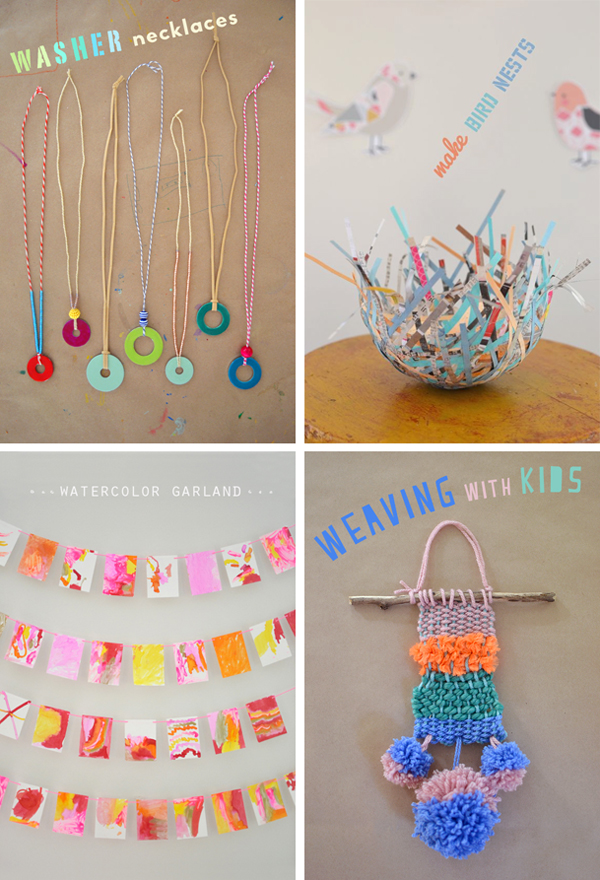
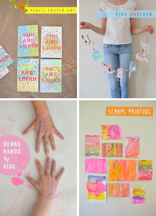
Above are four images with type. Here is why I chose the fonts and the colors that I did, and the name of the font that I used.
Washer Necklaces: I loved how the necklaces looked a bit rustic on the kraft paper, and how you could see the nail polish left on the paper. To me, it called for a stencil font, something with a rough, handmade feel. This one is called Portago. I paired it with a more modern font called Monod Brun. It’s good to have a ying and a yang when pairing fonts. The colors I chose reflect the middle three washers, creating a very satisfying design because of the balance.
Bird Nests: There was a perfect space above the nest, but it was at a weird angle. So after trying type straight across, I decided to put it sideways. The type isn’t really needed anyway, it’s just a design element so having it go sideways is cool and ads to the aesthetic. I chose another stencil font called Hogwild (not quite as rough), and a cleaner script called Pacifico. I used colors from the nest to create balance.
Watercolor Garland: I love this post, it is one of my favorites of all time. The work that these 4-yr olds did was so amazing and free. I loved the garlands on their own, but I did want to add some informational words at the top. Not to distract from the beautiful garlands, I chose to make the font very clean and subtle, all caps and in white so it almost fades away. This font is called Orator. I also hand drew little circles at the sides just to loosen it up a bit.
Weaving with Kids: This photo did not need a title, I just wanted something fun to add to the photo because it just looked too plain. The font is Peach Milk, and I used the colors from the weaving to create balance, and decided on a curved placement to create movement and interest.
Tip 3: follow my lead (10 hard and fast font rules)
1. Figure out the tone of your photo. Is it happy, serene, playful, serious, goofy? Once you figure out the mood, then you can start selecting your font.
2. Keep a list of your “go to” fonts (some new choices, take it out of your comfort zone). I have about 10-15 that I use the most, which are a mix of simple and playful.
3. Use script sparingly. It’s harder to read.
4. Just because your post is for or about kids doesn’t mean you should use kinder fonts. Child handwriting fonts are one of my biggest pet peeves. It degrades your hard work and it’s generic. And please, no Comic Sans.
5. Use black prudently. I use almost no black for fonts, but my photos are very colorful and kid-oriented. I like black, don’t get me wrong, but don’t have it be the only color you use because you’re afraid to try other colors. Embrace color!
6. Don’t use fonts on a photo that already has words. I made a birthday banner, it already says “Happy Birthday”. I don’t need more fonts.
7. Pair two fonts together (but not more than two). Mix and match. It adds interest and makes some words stand out more than others.
8. Learn a few font vocabulary words, like serif, sans serif and display. (Read this helpful article on fonts for starters.)
9. Apply for rich pins through Pinterest. This allows your logo, profile name and post title to display under your photo. Once you have this tool, it becomes redundant to put type on your photo with the same heading. Rich pins keeps you disciplined. You will rarely even have to worry about typography!
10. Less is more. Don’t add long sentences to your photo, just a few key words. Let your post title and description do the talking. (This is where rich pins are so important.)
Tip 4: you get what you pay for {free fonts vs. paid}
I did a somewhat loose survey of font usage within my blogger community. It turns out that about 85% of bloggers use free fonts. Bloggers who are also graphic designers are about the only ones who buy fonts. I guess this makes sense. I mean, why not choose something that is free?
As someone who pays for most fonts, I do have a position to take on free vs. paid.
Think of fonts as tools. Wouldn’t you rather use a good tool than a bad one? Your tools determine your level of design. Paid fonts have more characters, like math signs or ampersands (glyphs), and they have better kearning (the space between the letters) and spacing. Their edges are more rounded, which makes it look better when small. With a paid font, your risk of looking “generic” (because everyone has free fonts) is much lower. And at the very least, you are supporting designers when you buy a font.
In fact, you could even go further as ask… why pay for photographs when you have Google? Why pay for music when it’s free on the web? Why pay a designer when there are many websites who will design your logo for peanuts? The point is this: Paying for fonts elevates your design.
With that in mind, I do download free fonts from time to time. Not very often, but sometimes I like what I see.
Bottom Line: Try buying a font or two. Mix it up. Some free, some paid for. It will make you feel like a real designer! And sometimes, what we really need is a new attitude before we can accomplish great things. Fake it ‘til you make it!
(See Tip 10 for font resources.)
Five: the eye has to travel {design is everything}
The 2011 movie about Diana Vreeland, the famous Harper’s Bazaar magazine editor, was called The Eye has to Travel. I love this phrase and I want you to love it, too. Let it be your mantra from now and forever. This phrase is about design. Design is everything.
But what does design mean? When I was in art school, the one word used above all others when talking about design was balance.
Balance.
You know good design when you see it. Yes, you do! Whether it’s a smart phone, a car, or an old-fashioned soda bottle, we all have the ability to see the difference between good and bad design.
Take this one step further into two-dimensional design, and it gets a bit murkier. From blog pages and ads, to invitations and magazines, we are bombarded with images from every angle. It gets harder and harder to sort through the noise. But when we find something that is designed well, we will stop and stare and appreciate the beauty.
When you appreciate beauty, as we all do, you are tapping into your own taste and aesthetic. Developing that eye for design is something that takes time, but you can start by noticing what you like and what you find beautiful in what you see every day.
Notice that when your eyes land on something aesthetically pleasing, there is always a resting spot. And then your eye brings you around, and then it rests again. There is something there, something that makes you continue to stare. I am here to tell you that this something is balance.
When you love the way something looks, it’s because the balance is perfect.
Above are four photos from my blog where I added type specifically to create balance. Usually, I find a space and then use that space to reflect a shape or color from the photo. I will also share the font name with you.
monster patches (Limoen & Papercute) // cardboard animals (Ever After & Papercute) // ice cream cones (Tire Shop) // pom-pom napkin rings (Orator)
Six: shape up! {shapes are your friend}
When in doubt, add a shape and put some type in it. But don’t be reckless. I almost want to reach out and shake people sometimes when I see a giant shape covering their whole photo with big type all over it. This is not what I mean. No, no, no!! When I see this it tells me that this person either didn’t like their photo, or couldn’t find the right photo. It’s like when I turn my cell phone on in the middle of the night…I’m blinded! Definitely don’t write big words all over your photo. For me, as a devour-er of Pinterest, it makes me not even look at that pin. I will be scrolling away, and fast.
What I am talking about is using shapes aesthetically, to draw your eye in and to create a pleasing composition. Maybe you want to repeat a color that is at the bottom of your photo and you have a nice space at the top. Or maybe your photo needs a punch of color.
I personally like my shapes to disappear off of the edge. I don’t do that all the time, but more than half of the time I do. (I will put shapes in the middle for collages, read more about collages and round-ups in Tip 8). I also will make sure that the font doesn’t crowd the edges.
I usually draw my own shapes, but I also download some dingbat fonts which are helpful when I’m feeling like I’m in a rush. Visit my Fonts & Dingbats Pinterest board for ideas.
Here are the fonts I used for these photos:
pencil eraser art (Papercute) // bird garland (Papercute) // henna hands (Veneer & Pacifico) // scrape painting (Peach Milk)
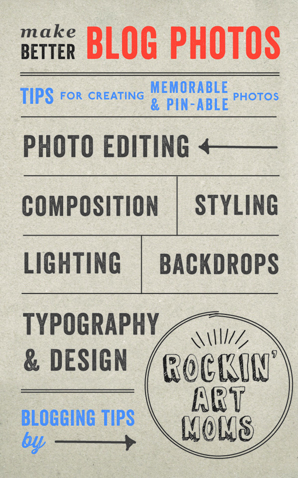
Seven: composition is king {photography tips}
Taking good photos comes before anything. For a good marriage between type and photos to work, you must have an idea of composition, styling, and lighting. Top of my list is composition, because if you have a totally awesome composition…you don’t even need to add type!
I have teamed up with my fellow Rockin’ Art Moms so that we can give you the best, most well-rounded advice on taking photos and adding type. There are so many elements to consider in photography!
The Rockin’ Art Moms (RAMs) are 16 mom bloggers who believe in the power of creativity as a necessary part of family life! We developed this blog series in response to a question we hear often: “How did you take such a great picture?” Each RAM participating in the series will be speaking about a different photo related topic.
Find all of the RAM links at the end of this post.
Eight: round ‘em up {type on photo collages}
Ok, this one needed lots of examples. The following points are my own guidelines for creating collages and adding type. There are lots of successful bloggers who get tons of repines and traffic to their blog making collages in a way that I wouldn’t. For me, and also for you now that you’ve read this far (you’re almost done), it’s about design and aesthetics, not about creating an ad and getting a message across.
~ Most round-ups are put together like a patchwork quilt, square or rectangular photos fit together like a puzzle. Make sure you create a white border in between each photo, and that this border is a consistent size. It should be an equal white border in between each photo.
~ One way to find space for your type is to create a block of color, instead of a photo, as one of the collage “patches”, as in the Paint Chips example above. In this collage, I also used blocks of color in some spaces. This is a good trick when the photos are not fitting together very well. Use the extra space as a design element.
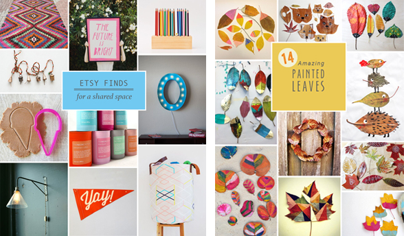
~ Another way to make space for type is to add a block of color on top of your collage, as in the Leaves and Etsy posts above. Make sure to not crowd your type inside your block of color. I just think it’s more pleasing to the eye to have a lot of color around your type. A place to rest your eyes.
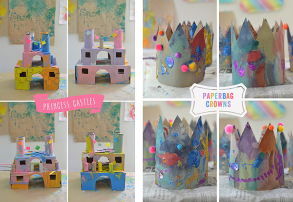
~ A third way to place type on a collage is to create a fun shape, like a banner or a circle. This more whimsical approach, like in Princess Castles and Paperbag Crowns, is just fun and creates a mood.
~ A super cool (albeit time consuming) way to make a collage round-up is to “tape” or “scrapbook” photos onto a neutral background. I have done this several times and it’s very eye-catching and makes a statement. The Easter Eggs post was one of my faves.
~ Still another idea for a round-up is to use only four photos from your list of 10 or 20, and then create a block of color on one side where you can add your type. I did this with a Wall Murals post, and also a Book Nooks post.
~ One other thing that I do sometimes is I don’t add any type at all, just some numbers. I let the rich pins title do the talking. And the numbers act as a design element. You can see this example with my Pop of Color post.
~ Try not to just add a block of black or white to the top of bottom of your collage and add type there. I know it’s the easiest, but it’s not the best. Try and integrate your type more with your collage so that it looks like it has been cared for and designed well.
~ On that same note, try not to add a big band of white space in the middle to put your type. It makes the image choppy with photos above and below.
~ Try not to clog your collage with tons and tons of type. Less is more. The photos will speck for themselves. And…if you have rich pins, you won’t need to repeat every word of your title in your collage.
~ I have a new pinterest board that I started called Round-ups & Collages where I am curating the best collages I’ve seen on Pinterest. This board will be a good reference for you when working on your collage.
Nine: don’t mess with me {remember rule #1}
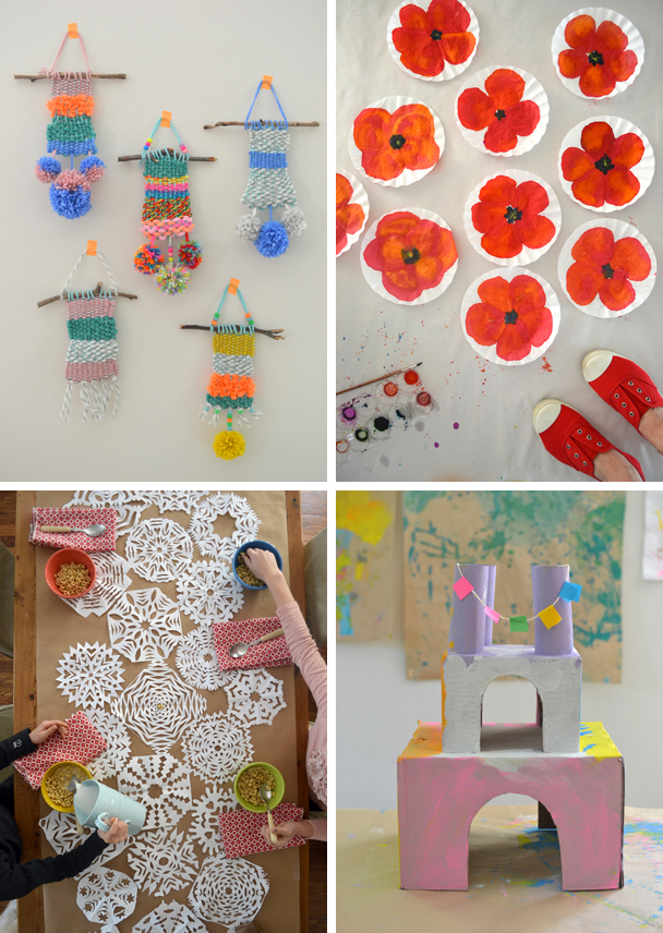
Ok, this is technically not a new tip. But I feel so strongly that most photos do not need to be messed with that I had to re-iterate my first point. Here are four more photos that I chose not to add type to that have done very well on Pinterest.
weaving with kids // poppy art // snowflake table runner // cardboard castles
I’m feeling uncomfortable at this point with all of this self-promotion. I am not the queen of everything and I certainly have had some flops. But I think that the more examples I can give you, the more you can learn.
Ten: a pep talk {and resource guide}
You can do it! You can do it! It’s hard, there is no denying this fact. But typography is soooo satisfying when you get it right. Just remember these three things, if you remember nothing else:
1. The eye has to travel. Make sure you leave some space for the eye to rest. Don’t make it too busy.
2. Balance is the key to good design.
3. Less is more. When in doubt, leave it out.
And now, here are some links that will help you tremendously:
MAKE BETTER BLOG PHOTOS: Tips for Creating Memorable and Pin-Able Photos brought to you by the ROCKIN’ ART MOMS:
Photo Editing: Ana from Babble Dabble Do
Composition: Meri from Meri Cherry
Styling: Gina from Willowday
Lighting: Jeanette from Tiny Rotten Peanuts
Backdrops: Melissa from Mama Miss
(Follow Rockin’ Art Moms on Pinterest….we have a really cool board that is sure to fill your lives with tons of creative ideas.)
FONT SHOPPING:
Paid Fonts: My Fonts This is where I shop. I love it the best because you can type in your word or phrase and then all of your searches will be with that sample text. This is such a helpful tool, I can’t express it enough!! // Font Spring // FontFont
Free Fonts: Font Squirrel // DaFonts
PINTERST BOARDS FOR FONTS, PHOTO STYLING, and COLLAGES:
Fonts & Dingbats (my board) // Font Obsession // Fonts // Type & Lettering // Photo Styling // Round-ups & Collages (my board)
OMG, that was really too long. Hopefully it will help those of you who want to be helped!! Ask me any questions.
xo, Bar
{PS: As if there is more to say…but actually, there is! Follow me on Instagram where you can see my creative ideas percolating.}
Such a great post, Bar. I read every word, and I don’t even have a blog. 🙂 Plus, it highlights some of your cutest projects!
WOW. I mean…this is just too good. Your knowledge and talent is too good. I will refer to this daily. I just learned so much I can’t even stand it. And I am so grateful for this ESSAY on design. This is going to help so many people. I just got EDUCATED! Thank you so much Bar!!!! You’re amazing. This post is amazing.
thanks meri cherry…this means so much to me you don’t even know. actually, you do know. it took everything out of me, but i’m glad it’s done. AND that it’s helpful to you and to others. that was my goal!! xo bar
Love this post! I completely agree with you about the over-using of text for Pinterest. When I come across a cool project with text on the photo, I usually click through and find a better photo from the post to pin (without text).
On the rare occasion I use text in a photo, I usually am unhappy with how it turns out. So I will surely be coming back to this for your great tips!
thank you so much megan!!! your photos and posts look beautiful at all times…you’re doing everything right! glad i can be a reference, though. xo bar
WOW, Bar, this is like a google search of all of the best and most amazing font advise from someone fantastic, cool and with an amazing aesthetic! I LOVE THIS POST! I can not believe how much information is here and my first response was to say that this was an ENCYCLOPEDIA… but, you’re so young + hip, you might not even possibly know what I am talking about! 🙂 Love this! Pinning this. Saving this!
… I really, really, like black and have this old, classical design teacher still whispering in my ear— but it always has to work in black… you maybe pushed me to break away and try something new: color! You use of color is so inspiring. I feel like I’ve just gone swimming it in — so beautiful!
thanks so much, gina. and i DO know what an encyclopedia is, silly! we’re probably the same age. i’m so glad you found it helpful. and as for black, you are right. my art school teacher used to say something similar…that your design needs to look balanced when converted to black and white. i actually sometimes print things out in b + w and squint my eyes to make sure there is good balance. i think using black type can sometimes be the perfect choice. but i’m glad you are considering color!! do it!! your photos are so amazing. xo bar
WOW! I have learned soooo much! This post is so helpful and has made me want to experiment with type more, buy a few special fonts, and stoop using black! I really enjoyed the section on collages because I always struggle with those. THANK YOU for this!!!!
I’m loving this series and I loved your post particularly! I’m still working on my images but so agree that no every image needs text – sometimes I think that’s what makes some stand out more on Pinterest now.
Personally, I don’t think I use enough colour so that’s something I might work on after reading your post. Thanks for sharing x
wow, thanks Nichole!!! i love hearing this feedback. after spending so many hours writing this thing, it’s soooo nice to hear that even just a little part of it will help you. thank you for reading this and all of our posts…i’m so impressed!! xo bar
Such a great post! Thanks for all the great tips and information.
thanks so much juliana!!! really glad it’s helpful to you 🙂 xo bar
Of course posts like yours help others! I’m sure I’m not the only one who has benefited from your generosity in posting what you have learnt. As I side note, my 10yr old knows that using Comic Sans is a big no-no 😉
This post was such a revelation to me! When I started taking blogging seriously, I felt such pressure to make every image fit the watermarked, text-overlay, Pinterest format, and this is such a freeing reminder that good photos don’t need text, and how to use it properly.
I’ll still likely use the free fonts I find and Canva, until my blog actually turns a profit 😉
yes! i’m so glad that you read this, jennifer, and that it reminded you to go back to ‘the basics’, as i call it. which means…just take a good photo and you don’t really need type. and i love all of your montessori posts…my kids all went to montessori early childhood programs. xo, bar
Thank you so much for this awesome post! Pinning it right now – this will be my go-to guide as I work on improving the images/graphics on our blog! Thanks! 🙂
What a fantastic and helpful article this is! I struggle with typography, so this is great for me! 🙂 Lisa
i’m so glad you found this helpful, Lisa. It took forever to write so i’m really happy that it’s useful to you. good luck! xo bar